This is a mod of the Nimbus GTK theme. It provides a clearer overall color, and adds Vista style menubar and panel from the LiNsta GTK theme.
NOTE: This is not a Vista clone. This theme uses the Nimbus widgets, not Vista. If you want the Vista widgets, use LiNsta or Aero-clone themes instead.
Dependencies ========= Requires the Nimbus GTK engine, so the original Nimbus theme must be installed first. Proposed Metacity theme : Nimbus Proposed Emerald theme : Vista Glow (recommended) Proposed icon theme : Human.
Credits ===== Mod based on Nimbus GTK theme by Sun Microsystems Inc., LiNsta GTK theme by etiennelaurent. Many thanks!!!
3. Download the Nimbus-Vistalooks theme archive, and save it to your home directory. Drag and drop this archive into the Gnome theme manager to install.
4. Install the Emerald window manager, to get the Vista style transparent window borders (recommended, see screenshots)
Ubuntu users, in a terminal window type: sudo apt-get install emerald Don't forget to enable desktop effects in the Gnome theme manager.
Root Tip ===== For a better experience, input this in a terminal: sudo ln -s /home/{username}/.themes /root "{username}" being your, well, user name. This way even root applications will be themed. Thanks to perfectska04 for this tip.
Panel Tip ====== If you use a panel higher than 24 pixels, go to HOME/.themes/Nimbus-Vistalooks/gtk-2.0, edit the gtkrc file and replace "Panel/panel-bg-black-24.png" with "Panel/panel-bg-black-36.png" or "Panel/panel-bg-black-48.png"
Firefox Tip ======= If you want a white font in Firefox menubar, copy the file HOME/.themes/Nimbus-Vistalooks/Firefox/userChrome.css to HOME/.mozilla/firefox/.../chrome/
Enjoy!Last changelog:
Mar 21 2008 1.0 First release Apr 11 2008 1.1 Improved menus, toolbars and general style Apr 14 2008 1.2 Changed toolbar color Apr 20 2008 1.3 New blue gradient toolbar May 3 2008 1.4 New blue toolbar May 5 2008 1.5 New themes pack with alternative themes May 22 2008 1.6 Minor tweaks June 7 2008 1.7 Minor tweaks Jul 23 2008 1.8 Removed lower quality alternative themes Jan 18 2009 1.9 Embossed black panel handles, black fast user switching menu, black menu arrows Jan 29 2009 1.10 Now supports Gnome colors scheme for easy customization of a few parameters such as selection color and tooltips color
I love the Nimbus theme and your spin on it makes it even more beautiful! This theme would look even better, in my opinion, if you re-colorized the progress bar to Vista's green (currently it's orange.) Keep up the good work!
>This theme would look even better, in my opinion, if you re-colorized the progress bar to Vista's green (currently it's orange.)
There is a user who made this change for nimbus (that orange looked too ubuntuish, no thanks)... the package with patch is at http://jftp.medozas.de/SRPMS-11.1/gtk2-theme-nimbus-0.1.1-2.2.jen2.src.rpm
I hate peoples, copying something.
"Talented artist copying someone's work, genius one stealing it" - Van Gogh sad.
All you can do is talently copy instead of create somethign really cool.
And if you'll say me, what peoples like it, thats not a measure of good work, thats just a measure of someone's bad tastes.
My opinion is in that: linux must have its own style, instead of copying anything. Here are lot of vista-ish styles and they looking equally to each other.
Thats why i rate it 'bad' and thats why i will rate 'bad' all Mac-ish, Vista-ish and XP-looking like content.
Maybe not all people are equally talented, or have equal time to give birth and mature a new creation?
Puzzled that a simple theme can stir so much passion!
Keep up the good work. It is definately not my taste, but is done very well. I am voting good based on the work, not on weather or not I think you wasted your time or the time of the linux community ( which you did NOT do ) If people dont like areo based themes then they should not vote them down or leave comments about how terrible they are!!! But hey, thats just my opinion
I agree, I like everything about this theme EXCEPT these little white dotted rectangle things on the taskbar, where you click to move the window list and notification area
http://www.gnome-look.org/CONTENT/content-files/96446-Screenshot.png
Perenoel, any chance of that changing in a future update? Great work thus far!
Hello,
Finally had time to try and answer this question.
In gtkrc file, replace the last lines :
widget "*PanelWidget*" style "panelbuttons-black"
widget "*PanelApplet*" style "panelbuttons-black"
#Comment out the following line if you use a transparent panel
class "*Panel*" style "panel-black"
#Not sure if you need any of those?!...
#widget_class "*notif*" style "panel-black"
#widget_class "*Notif*" style "panel-black"
#widget_class "*Tray*" style "panel-black"
#widget_class "*tray*" style "panel-black"
#class "*notif*" style "panel-black"
#class "*Notif*" style "panel-black"
#class "*Tray*" style "panel-black"
with these ones :
# Theme panel elements
widget_class "Panel*GtkToggleButton" style:highest "panelbuttons-black"
widget_class "Panel*GtkButton" style:highest "panelbuttons-black"
widget "*PanelWidget*" style:highest "panel-black"
widget "*PanelApplet*" style:highest "panel-black"
widget "*fast-user-switch*" style "panel-black"
class "PanelApp*" style "panel-black"
class "PanelToplevel*" style "panel-black"
widget_class "*Mail*" style "panel-black"
widget_class "*notif*" style "panel-black"
widget_class "*Notif*" style "panel-black"
Uses the original Nimbus engine to draw the handles. Hope you like it better that way!
please please invest your canny knack in making a theme that looks as pretty as aero,but does not resemble it in any way.tell me,was aero the last good theme that could be made.yeah,aero is a very good theme.why not have something equally good or even better on linux,but something absolutely original,something with glossy panel,glossy menus,glossy stripe(the one that contains file,edit,etc.)?why copy someone's work?why give microsoft a chance to claim that a number of linux themes imitate its native aero?
So let's see...you have a blue-green stripe across the top of your windows and a black taskbar...have you fooled yourself that you're running Vista? Why not focus your creative energy into coming up with something new and innovating. Microsoft's shoddy crap isn't new or innovative.
The fact you don't like Aero Style doesn't matter here, just pass on it. There is people who like Aero style, Linux is choice, this is one proof of what Linux is capable for theming.
When 5 apps do exactly the same things do you scream? No. So do the same.
And obviously that was done as a parody of Vista; hence the phrase "Hasta La Vista." Furthermore, I change my wallpaper images as frequently as I change underwear. Geesh! I don't care for Vista and haven't run Windows on any of my machines for years. It's not that I object to Vista inspired themes when they're original works. When someone tries desperately to replicate another OS in every detail, so that it's nearly indistinguishable from the real thing in some crazy attempt to fool themselves (and presumably others) that I draw the line. All that energy could go into something new and unique for Linux.
If you actually LOOK at the screenshots, you would notice that the scrollbars look NOTHING like Vista's. I have no objection to your statements, other than the fact that this theme does not try to replicate Microsoft's latest heap of dung, it just incorporates some elements of it. I happen to like some of Microsoft's designs, and I also like the Nimbus engine, so I happen to quite like this theme. I am not forcing you to do so as well, but you have to give the man (or woman) credit for using a less common engine for the theme. I voted good.
More seriously: I would also love to see more original, creative and modern themes for Gnome. Unfortunately I'm not a designer, and have no time to create a whole new, shiny, glassy modern theme. Today, Clearlooks is clearly not my taste...
If you have references to those kind of themes, I'd be grateful to hear!
VERY happy this time with a tweaked version of the Dust theme. Modified selected color to #6F87E7 in GNOME themes preference dialog to have a nice blue overall color instead of the original dark brown.
You need better (higher quality) screenshots. That might help improve the rating....I don't think it is just the word Vista that is bringing the score down.
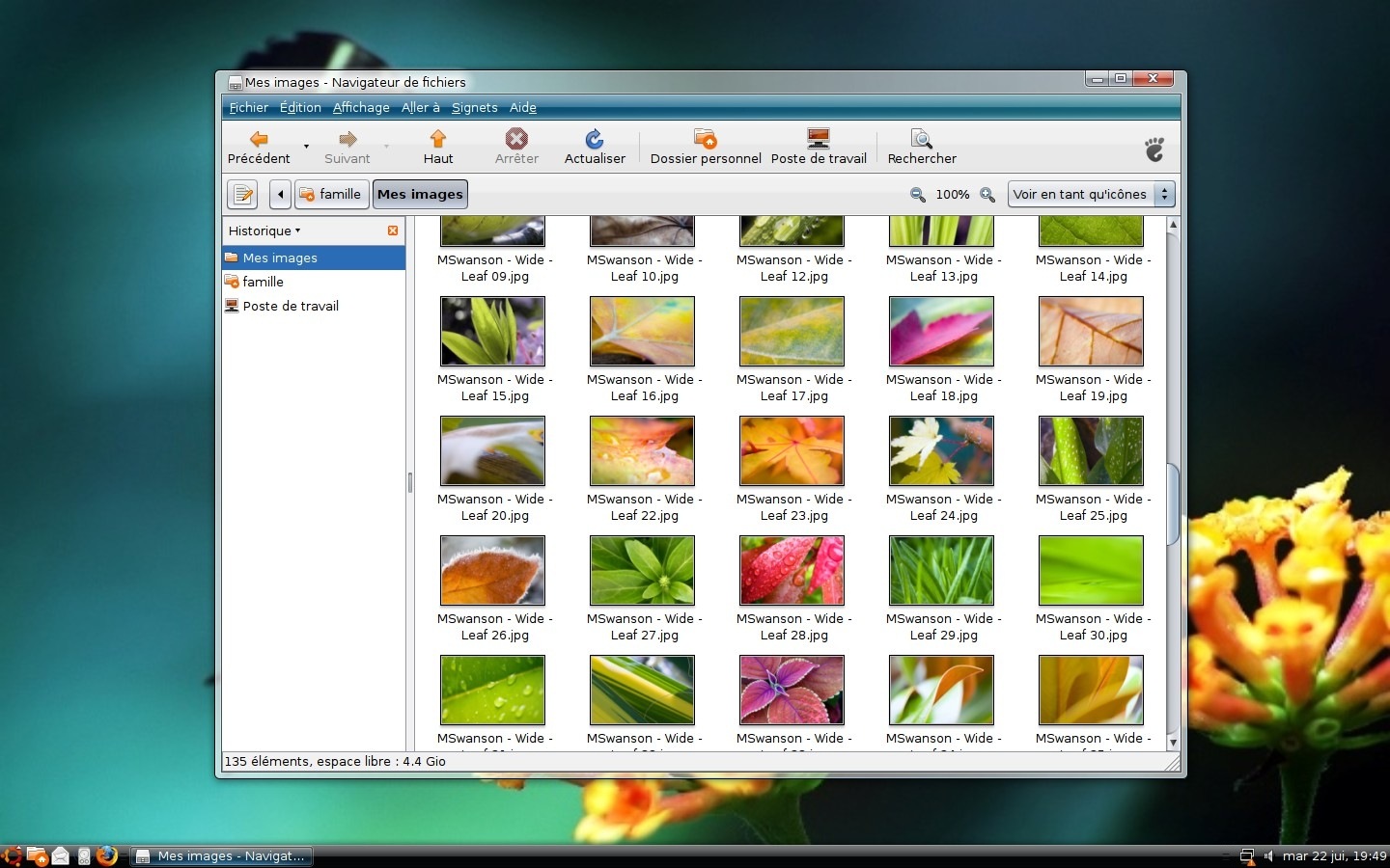
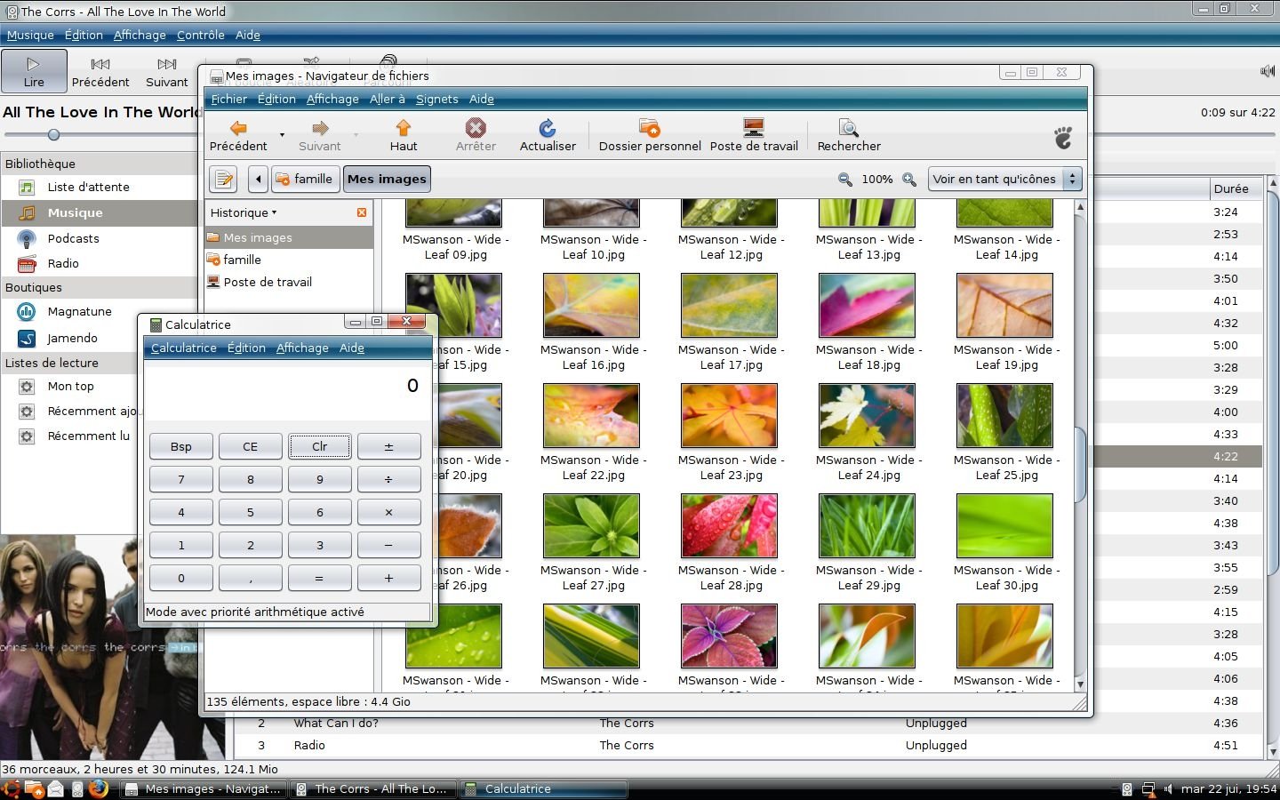
All widgets are unchanged and rendered directly by the Nimbus engine.
Have a look at the scrollbars on my screenshots for example.
Are you sure that you also have the original Nimbus theme installed on your computer?
Nimbus-Vistalooks depends on the original Nimbus theme engine.


Ratings & Comments
25 Comments
I cannot get the theme to work. I have everything installed, and emerald is up and running but I cannot get the theme to run.
Love it ... thanks
I love the Nimbus theme and your spin on it makes it even more beautiful! This theme would look even better, in my opinion, if you re-colorized the progress bar to Vista's green (currently it's orange.) Keep up the good work!
>This theme would look even better, in my opinion, if you re-colorized the progress bar to Vista's green (currently it's orange.) There is a user who made this change for nimbus (that orange looked too ubuntuish, no thanks)... the package with patch is at http://jftp.medozas.de/SRPMS-11.1/gtk2-theme-nimbus-0.1.1-2.2.jen2.src.rpm
I hate peoples, copying something. "Talented artist copying someone's work, genius one stealing it" - Van Gogh sad. All you can do is talently copy instead of create somethign really cool. And if you'll say me, what peoples like it, thats not a measure of good work, thats just a measure of someone's bad tastes. My opinion is in that: linux must have its own style, instead of copying anything. Here are lot of vista-ish styles and they looking equally to each other. Thats why i rate it 'bad' and thats why i will rate 'bad' all Mac-ish, Vista-ish and XP-looking like content.
Maybe not all people are equally talented, or have equal time to give birth and mature a new creation? Puzzled that a simple theme can stir so much passion!
that wasnt van goh, that was Picasso. and your angry comments go against the quote which leaves me wondering why you quoted it....
Keep up the good work. It is definately not my taste, but is done very well. I am voting good based on the work, not on weather or not I think you wasted your time or the time of the linux community ( which you did NOT do ) If people dont like areo based themes then they should not vote them down or leave comments about how terrible they are!!! But hey, thats just my opinion
I like it, except for the white panel separators (a more "etched" look would be better) and there's a white border around the window selector applet.
I agree, I like everything about this theme EXCEPT these little white dotted rectangle things on the taskbar, where you click to move the window list and notification area http://www.gnome-look.org/CONTENT/content-files/96446-Screenshot.png Perenoel, any chance of that changing in a future update? Great work thus far!
Hello, Finally had time to try and answer this question. In gtkrc file, replace the last lines : widget "*PanelWidget*" style "panelbuttons-black" widget "*PanelApplet*" style "panelbuttons-black" #Comment out the following line if you use a transparent panel class "*Panel*" style "panel-black" #Not sure if you need any of those?!... #widget_class "*notif*" style "panel-black" #widget_class "*Notif*" style "panel-black" #widget_class "*Tray*" style "panel-black" #widget_class "*tray*" style "panel-black" #class "*notif*" style "panel-black" #class "*Notif*" style "panel-black" #class "*Tray*" style "panel-black" with these ones : # Theme panel elements widget_class "Panel*GtkToggleButton" style:highest "panelbuttons-black" widget_class "Panel*GtkButton" style:highest "panelbuttons-black" widget "*PanelWidget*" style:highest "panel-black" widget "*PanelApplet*" style:highest "panel-black" widget "*fast-user-switch*" style "panel-black" class "PanelApp*" style "panel-black" class "PanelToplevel*" style "panel-black" widget_class "*Mail*" style "panel-black" widget_class "*notif*" style "panel-black" widget_class "*Notif*" style "panel-black" Uses the original Nimbus engine to draw the handles. Hope you like it better that way!
Updated theme to fix this issue. New version 1.9 provides embossed black panel handles and also a black fast user switching menu.
please please invest your canny knack in making a theme that looks as pretty as aero,but does not resemble it in any way.tell me,was aero the last good theme that could be made.yeah,aero is a very good theme.why not have something equally good or even better on linux,but something absolutely original,something with glossy panel,glossy menus,glossy stripe(the one that contains file,edit,etc.)?why copy someone's work?why give microsoft a chance to claim that a number of linux themes imitate its native aero?
So let's see...you have a blue-green stripe across the top of your windows and a black taskbar...have you fooled yourself that you're running Vista? Why not focus your creative energy into coming up with something new and innovating. Microsoft's shoddy crap isn't new or innovative.
The fact you don't like Aero Style doesn't matter here, just pass on it. There is people who like Aero style, Linux is choice, this is one proof of what Linux is capable for theming. When 5 apps do exactly the same things do you scream? No. So do the same.
Looks like you've been there... http://www.gnome-look.org/content/show.php/Linux-Vista?content=50839
And obviously that was done as a parody of Vista; hence the phrase "Hasta La Vista." Furthermore, I change my wallpaper images as frequently as I change underwear. Geesh! I don't care for Vista and haven't run Windows on any of my machines for years. It's not that I object to Vista inspired themes when they're original works. When someone tries desperately to replicate another OS in every detail, so that it's nearly indistinguishable from the real thing in some crazy attempt to fool themselves (and presumably others) that I draw the line. All that energy could go into something new and unique for Linux.
If you actually LOOK at the screenshots, you would notice that the scrollbars look NOTHING like Vista's. I have no objection to your statements, other than the fact that this theme does not try to replicate Microsoft's latest heap of dung, it just incorporates some elements of it. I happen to like some of Microsoft's designs, and I also like the Nimbus engine, so I happen to quite like this theme. I am not forcing you to do so as well, but you have to give the man (or woman) credit for using a less common engine for the theme. I voted good.
More seriously: I would also love to see more original, creative and modern themes for Gnome. Unfortunately I'm not a designer, and have no time to create a whole new, shiny, glassy modern theme. Today, Clearlooks is clearly not my taste... If you have references to those kind of themes, I'd be grateful to hear!
VERY happy this time with a tweaked version of the Dust theme. Modified selected color to #6F87E7 in GNOME themes preference dialog to have a nice blue overall color instead of the original dark brown.
It makes nimbus looks more "human"!
You need better (higher quality) screenshots. That might help improve the rating....I don't think it is just the word Vista that is bringing the score down.
Uploaded higher quality screenshots (up to the 300K limit). Thanks!
You must be joking. I haven't seen any nimbus trace.
All widgets are unchanged and rendered directly by the Nimbus engine. Have a look at the scrollbars on my screenshots for example. Are you sure that you also have the original Nimbus theme installed on your computer? Nimbus-Vistalooks depends on the original Nimbus theme engine.